Restaurant Branding

팔팔 PALPAL
Brand identity development for Korean style tapas restaurant, targeting young generations in New York City.
PALPAL highlights the merge of multiple Asian culture through menu and visual attractions, reflecting the critical characteristic of its local region.
Role Graphic Designer / Visual Director / Project Manager / Photographer

Primary
Base
Highlight
Logo
With a dual definition of PALPAL, the logo symbolizes its mission to create a 88 space.
1. the state of being lively & energetic
2. pronunciation of number 88
The infinite line represents the organic characteristic of culture, how a new type of culture can be created by combining multiple lifestyles.
Different forms of PALPAL visualize the dynamic vibe & flavors of dishes created by brand.

Menu
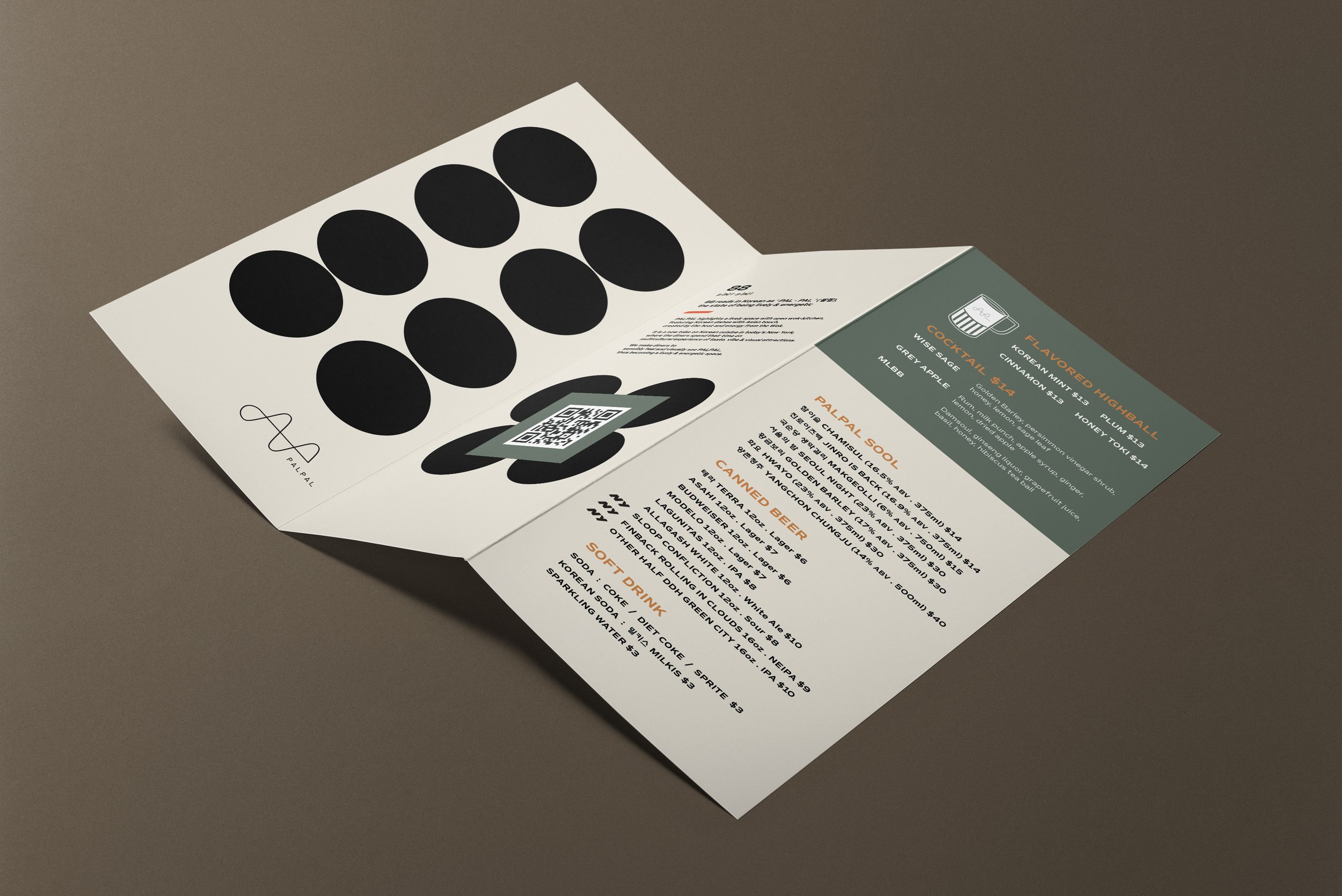
Brochure type menu with all-in-one page layout creates a tapas restaurant vibe and encourages to choose multiple dishes.
The design visualizes easy-to-approach menu choices with affordable price and small serving size.
11.75 x 8.5 in. (unfold) / Uncoated 90lb Trifold
Online Strategy
Website
A single page navigation simplifies user experience & leads the viewer right to the brand identity.
Viewers can easily guess the keywords of the brand from images, such as Asian, tapas & restaurant, and get just enough information to approach.
SNS
Collection of photos focusing on takeout services and dynamic moments of open wok-kitchen to emphasize “easy & fast” cuisine


